
Hi Julie!
We’ve spent some time trying to do a couple of things with these logos.
Get the hook to be a bit more prominent (and accurate) without killing the vibe.
Provide some alternatives to how we could feature the hook and keep the logos.
Looks them over and see if something starts to pop here! We are digging the direction for sure!
Heidi/Ryan
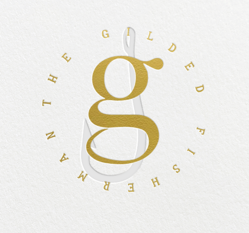
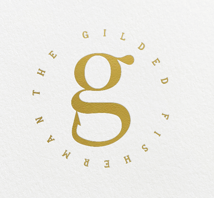
these first two are actually simpler logos with the hook blind embossed in the back just to get a better picture on how we could implement the hook and still keep some very clean/modern luxury vibes for the logo itself.
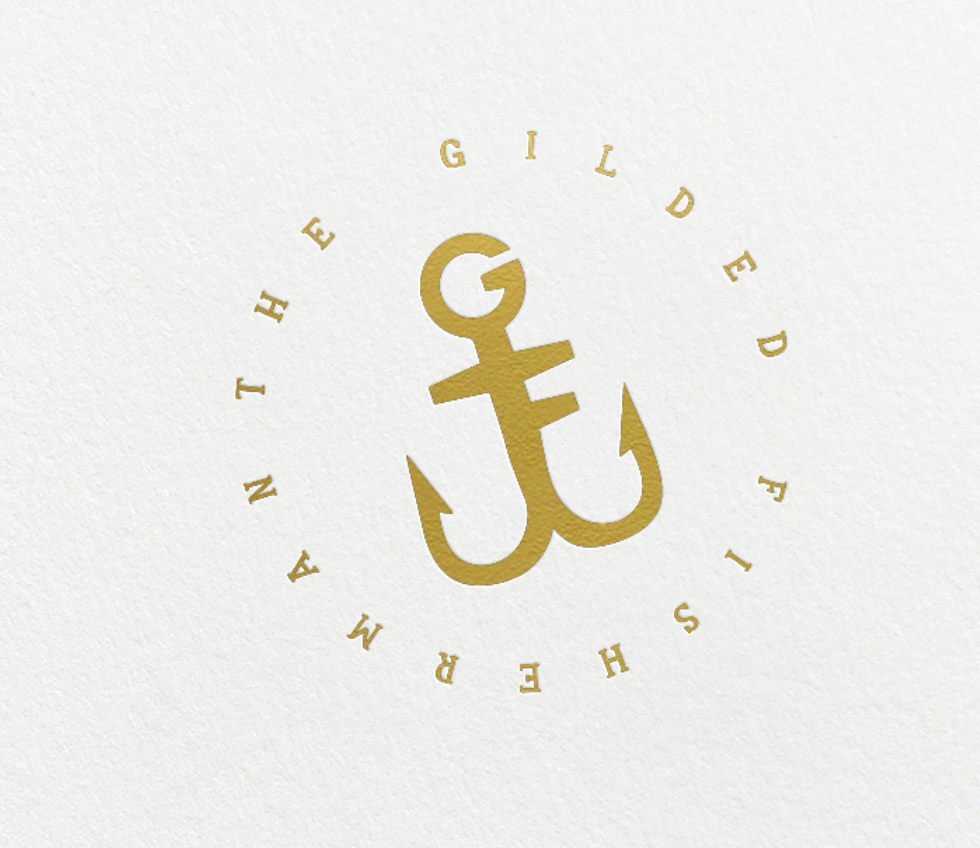
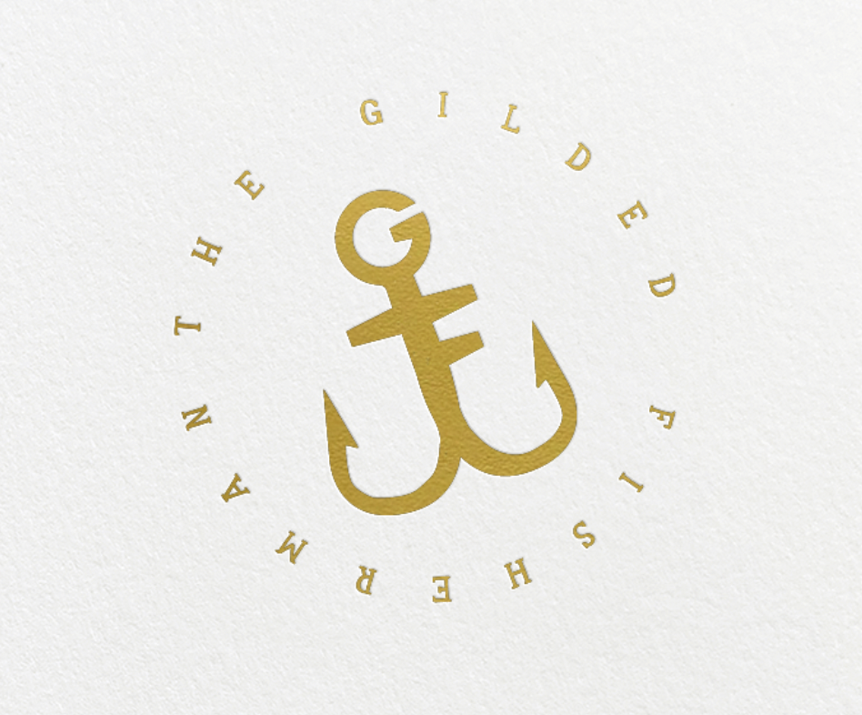
next are two variations of the anchor - a little more hook involved on each. very subtle differences but the first is a bit tighter and smoother.
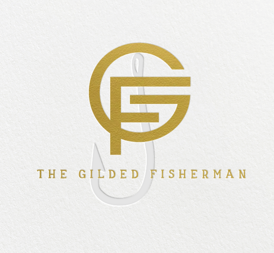
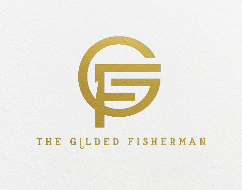
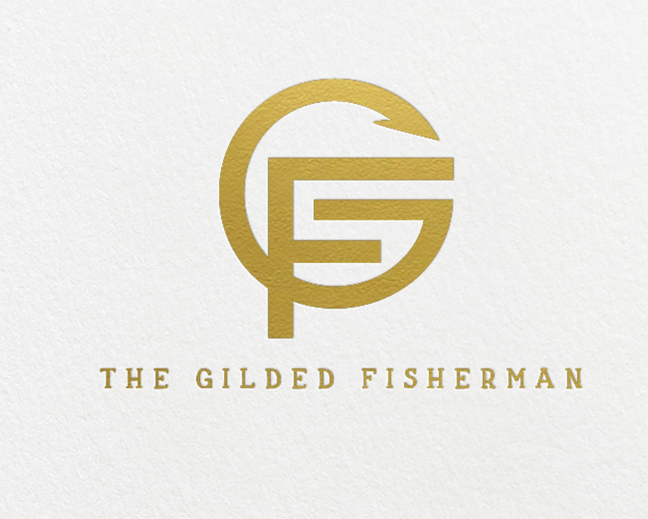
next are a couple of variations of the most mod look - getting the hook is tricky - trying not to ruin the vibe but these are both pretty cool. the hook its there, albeit very subtle. Also added the hook in the text on the first - not sure we love that.
final is the original lowercase g but with a more pronounced, accurate, hook.